EXHIBITIONS & TRADESHOWS
ILLUSTRATIVE
Submitted cover artwork, with captions


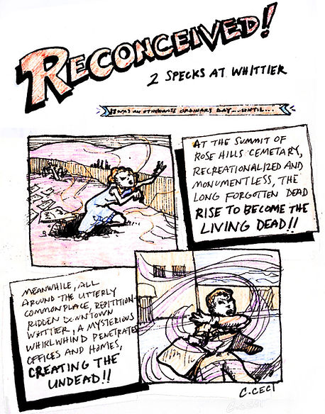
Storyboard, Reconceived!
A hypothetical occurrence at Whittier
As part of a larger project aimed at generating new architecture around the city of Whittier, these storyboards animated themes discovered during a lengthy analysis phase. The crux of the conjured narrative centers around interplay between downtown, the nearby memorial park, and the industrial ravine connecting the two.
Site narrative notes (above), and sketch for storyboard title page (left)

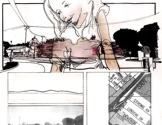
Excerpt frames from narrative storyboard (above), with corresponding physical site documentation (top & bottom),
Compilation key of frame's location horizons' and time-coded diagram of their respective viewing 'windows' (right), with detailed visualization from one vantage (below)


After the initial survey of the city, the characters of these three distinct sectors began to develop. The project continued to study these areas via their physical properties - topography, horizon foliage, edifice, etc. - while simultaneously envisioning a narrative to animate connections between them.
The narrative was taken to extremes, where 'living dead' and 'un-dead' characters travel along documented routes to meet each other among the oil derricks and water tanks of the vast, middling gulch. This bizarre storyline took form in a composite storyboard that utilized reference imagery from the site to help visualize personal impressions of the place.

Drawings, The Timely Sketch
Shown are examples from a currently defunct personal series - posted daily for two years and intermittently afterward. The content and media is varied based on inspiration and time availability. Some entries establish more developed themes for the week, while many remain rapid and unrelated doodles.


Aimed at keeping the creative juices flowing outside the professional realm, this series allows quick studies without many constraints.
The sketches employ typical ink and pencil - but also explore crayon, chalk, collage, computer, even spirograph. The hope is to one day resume this healthy exercise.


Examples from the series, showing both excerpts from week-long thematic sets and one-off entries


Working from sketch to hard-lined and textured composition, the artwork covered a range of topics from city-centric concerns, to national issues, to concurrent global events. Some serious, some sarcastic, one entry makes use of a stray squiggle from the original art to overwhelm a helpless Eustace in "The Rise of The Insignificants"


Cover Artwork, The New Yorker
Proposals, Condé Nast's Your Eustace competition
Nine submissions were created for the New Yorker's annual Your Eustace competition, where the public is invited to contribute hypothetical cover art. The entries can be playful, critical, satirical, or otherwise, with these submissions touching in-part on all of these moods.
While the competition results in an amazing mix of takes and techniques in tackling the challenge, this personal set of entries kept to emulating a rendering style in-keeping with the inaugural Tilley cover, drawn by Rea Irvin in 1925. Focus was placed on the content, making playful suggestions to - and appropriations of - elements from the original piece. This proved to present more than enough inspiration for a series of contemporary variants.


Original 1925 "Eustace Tilley" cover, shown above-left
This band wanted their debut album art to become a homage to the band’s hometown of San Francisco. The two spreads depict a streetscape view for the cover, and an aerial view for the centerfold - both taking subtle cues from illustrated LP art of decades earlier.


Working from a variety of reference imagery, the panoramic illustrations are cartooned to include various areas and landmarks around the city, from the immediate neighborhood on the cover, to a 270-degree aerial expanse depicted on the inner spread. Where-as the original reference album artwork highlights the Golden Gate from the hills of downtown, this fresh take on the city inverts the vantage, casting the view towards the city's business core and shipping yards.


Logos & album artwork,
Bonjour!
Les Petite Graine
Maman et Moi
for Sophie & Les Petits
For a debut album and two sequels, album artwork was created to capture the energetic recordings and performances of the music. Intended as a fun way for kids to learn French, illustrations of the children vocalists were themselves incorporated into the artwork as colorful texture fills.
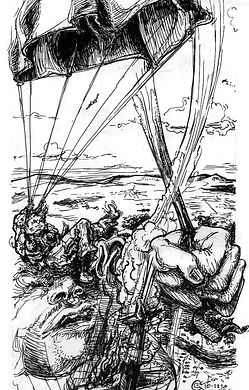
In developing the first album's art, a theme of exploration was chosen as an apt reflection of the song topics, and the hot air balloon became the playful symbol for travel around this world of language and instrumentation.
Ultimately, a drifting fabric was chosen as the proper medium for the children's doodles, as it drifts through the air like an abstract and elongated French flag.

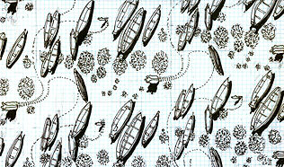
Artwork for the second album aimed to mirror the record's progression towards even more refined use of instrumentation in its production.
As the vantage of the globe moves closer into view, we get a clearer view of this curious landscape of colorful hand-tufted trees, again filled with kids' scribblings. At the centerfold, we see one of the balloonists hurling "Le Petite Graine" towards the earth: surely a good omen of things to come!


The third album, "Mama et Moi", is a more stripped-down offering, with the recordings featuring Sophie singing and playing with two or fewer children on each track. While it maintains the prevailing balloon theme, this 'white album' now presents the French flag in a slightly less complex tangle than the previous two covers.


Wedding announcements
Lake Mohawk, NJ
Commissioned to create all print components for a wedding, one key developmental factor was a desire to minimize the amount of mailed paper. Inspired by stained glass, the primary graphics are designed around stock postcards and pre-scored, printable envelopes. This enables the cards and mailers to become one-in-the-same, without the need for inserts.

The main invite furthers the stained glass reference, already suggested by the scored panes. The Mucha-inspired content illustrates natural elements, site-specific the lakeside wedding location -- motifs continued in the "thank you" mailers. The only additional components to be printed were the map & directions insert, scored to include a detachable RSVP postcard, and a final adhesive seal.


Save the date postcard, front & back (above), with preliminary concepts (right)


Inner panes of invite mailer, with concept sketch (far right)
Envelope seal (above), inner panes of "thank you" mailer (left), map insert (right)


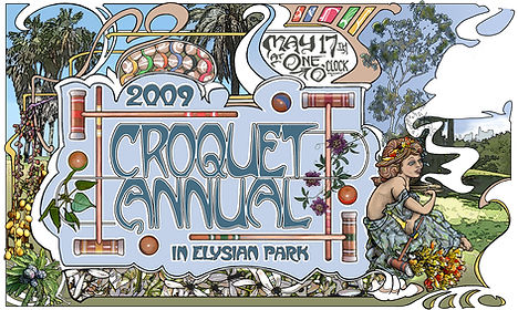


Event posters, Elysian Park Open
Los Angeles, CA
Seventeen years of posters have been created for this annual event held in Los Angeles. Continually varied in their presentation, the posters often share themes common to burgeoning summer, casual sport, site-specific references, and a sprinkling of the fantastic.
What began as a day of simple leisure gradually developed a slight competitive nature, both on the croquet pitch and in the yearly attire contest. It has since returned to its less-rigorous roots, filling the park with blankets and children, mallets, and wickets. The posters have aimed to reflect the playful nature of the day, through all its various incarnations; full of color, flora, and sportive pretense.


Various incarnations & details from the annual poster
